Road to hire | brand refresh
HOW MIGHT WE
Redesign the Road to Hire brand identity to position them as a top nonprofit in the Charlotte area.
background
Road to Hire is a Charlotte, NC area nonprofit that mentors students from historically underprivileged communities and fast-tracks them into high-earning tech careers at local corporate businesses.
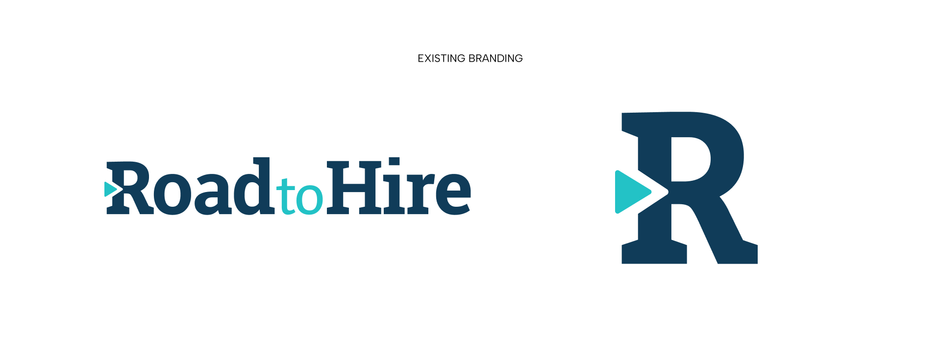
Road to Hire was founded in 2014, and its original branding kit was established around 2017. Since then, it hasn't seen much change. While the nonprofit saw complete success, they still relied on their original set of assets.
It became clear in 2025 that Road to Hire needed to establish a new brand identity to match their program's success.
Brand refresh
A brand refresh, in contrast to a full rebrand, allows a brand to undergo a change in appearance without fully changing its identity. Many recognizable brands have undergone refreshes, often without notice.
For Road to Hire, it was an opportunity for me to introduce some consistency and structure to a brand that had been lacking since the beginning. The R2H leadership wanted to maintain their brand recognition without starting fresh. This meant keeping their core color palette and some of their most recognizable elements, like the arrow in the letter R. These parameters still left me with a lot of room to improve their look and feel.
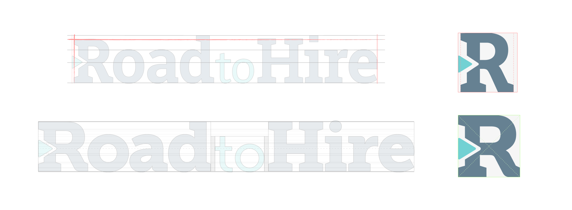
For a nonprofit whose focus is on real students and their success, the logo felt rigid and impersonal. The typeface in use has a lot of harsh corners and flat edges. Even the tittle in the "i" in "hire" is a rectangle with sharp corners.
Without much of the original branding documentation, I did some research on the logo's typography and found that it was likely a slight alteration on the typeface Bitter Pro. The typeface is not a part of their brand identity elsewhere.
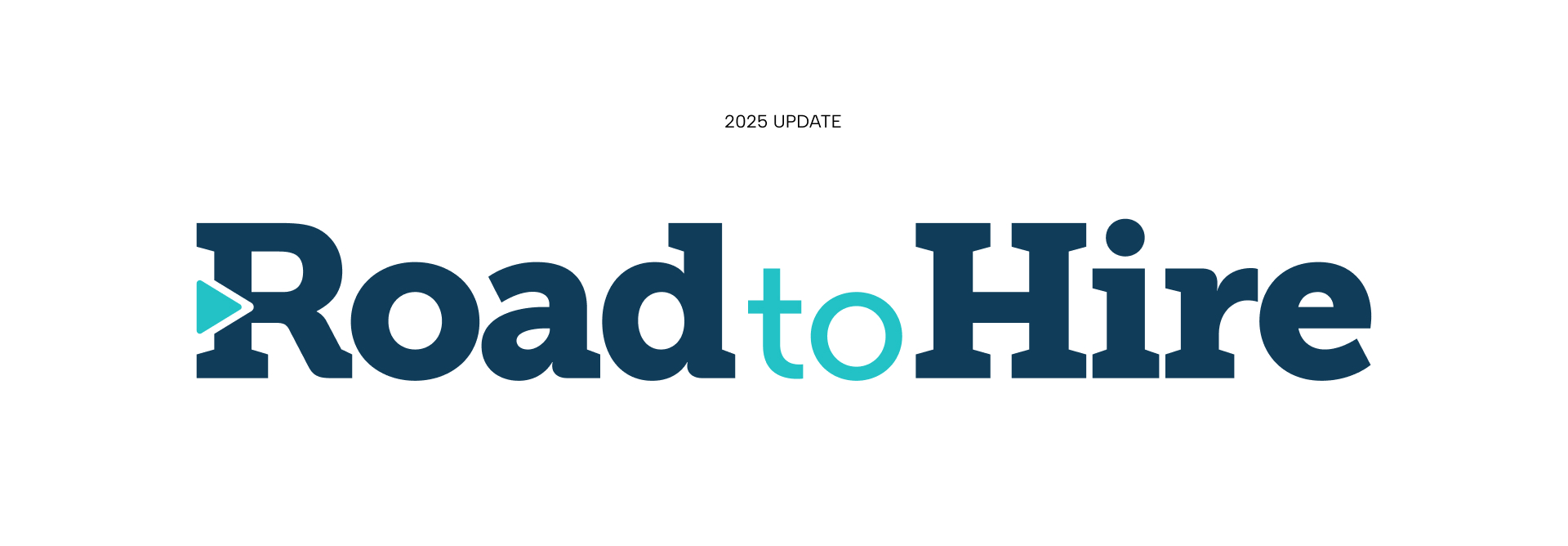
I decided to use a typeface in the logo that could also become a part of the brand. Museo Slab offered a more approachable look. With a bit more weight and round edges, the type appears softer and more approachable. No shade toward whoever originally designed the mark, but at first glance, it appears to have just been spaced evenly, like a word that's been typed out, rather than giving the structure of the logo any consideration. The new R glyph fits inside a perfect square, and the arrow's tip creates a line that perfectly bisects the R, the crossbar in the T in "to", and the H in "hire." It aligns perfectly with points in the "a" and "e". These are details that will likely go unnoticed by 95% of people who interact with the logo daily, but together they prove that the logo was intelligently designed with purpose and can be broken apart to create a system.
The folks at Road to Hire are getting to know every student, their families, their birthdays, and their favorite movies. The program's identity deserves that level of attention, too.
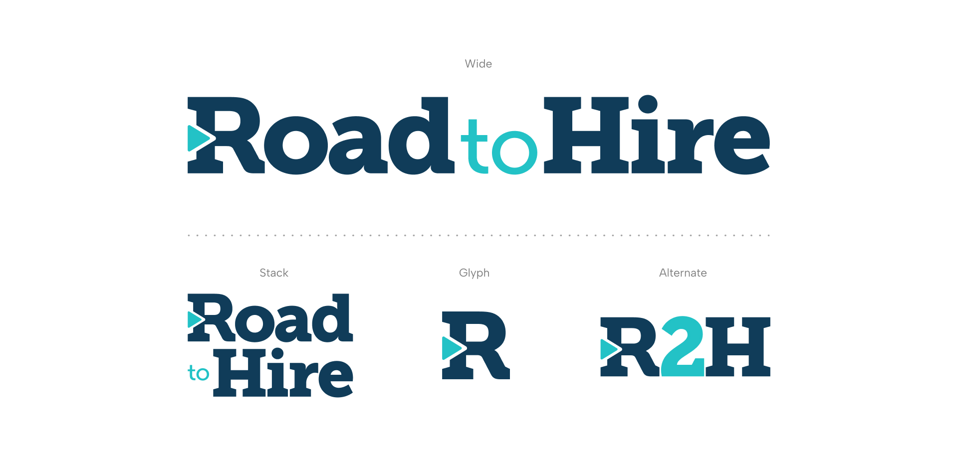
Taking the time to focus on the structure of the mark also allowed me to create a more modular system for the logo. Road to Hire originally relied on the original logo and an R glyph. My new logo could be split up to form a new stacked lockup, or even an R2H alternate to match how the team refers to Road to Hire internally.
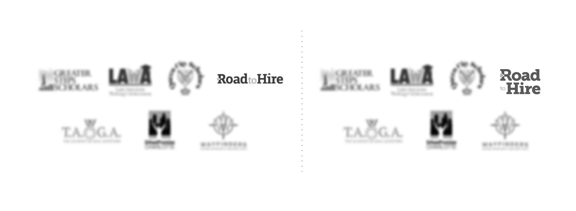
I did research on how Road to Hire compares to other competitors across the nation and in Charlotte. When placed alongside them in a logo grid, having an alternate stacked lockup makes Road to Hire stand out. The logos in these grids are often visually scaled so that they appear to take up the same amount of the viewer's attention. Road to Hire's original wide lockup was often scaled down to fit the width of the other square lockups, causing it to appear smaller in contrast.
The new stacked lockup has a more squared design, allowing it to be evenly scaled with other logos that are seals or icons, but R2H's focus is still on the name.
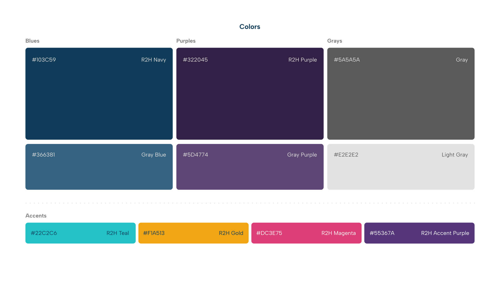
Color
I also introduced more color to the R2H brand palette. Instead of only relying on the Navy and Teal from the R2H logo, and the Gold and Orange from their Golden Door Scholars program, I decided to include some new colors to bridge the gap between the existing colors and bring in more warmth.
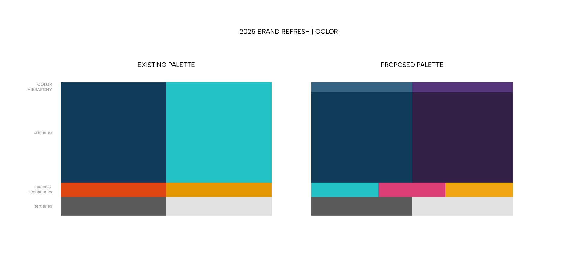
As a nonprofit that acts as both a mentorship program to students and a recruiting partner to businesses, Road to Hire is split between two primary audiences. The interests of these two audiences are widely different. Students want a program that understands them, that's approachable, and that cares about their success, but is also able to follow through for them. Charlotte corporate businesses want a workforce that is young and understands tech, and a program that can promise to deliver that to them.
The new palette I proposed offers the Navy and Teal that already have built brand recognition with corporate partners. This duo is reminiscent of college programs, banking, and finance. Introducing the neutral purple colors to the palette brings in some warmth that can be used on student-facing collateral. It's more approachable and feels relatable. It also brings in that familiar Charlotte Teal and Purple from the Hornets. As a nonprofit that set out to close the wealth gap in Charlotte specifically, the brand should be informed by its surroundings so that their goal is always visually apparent.
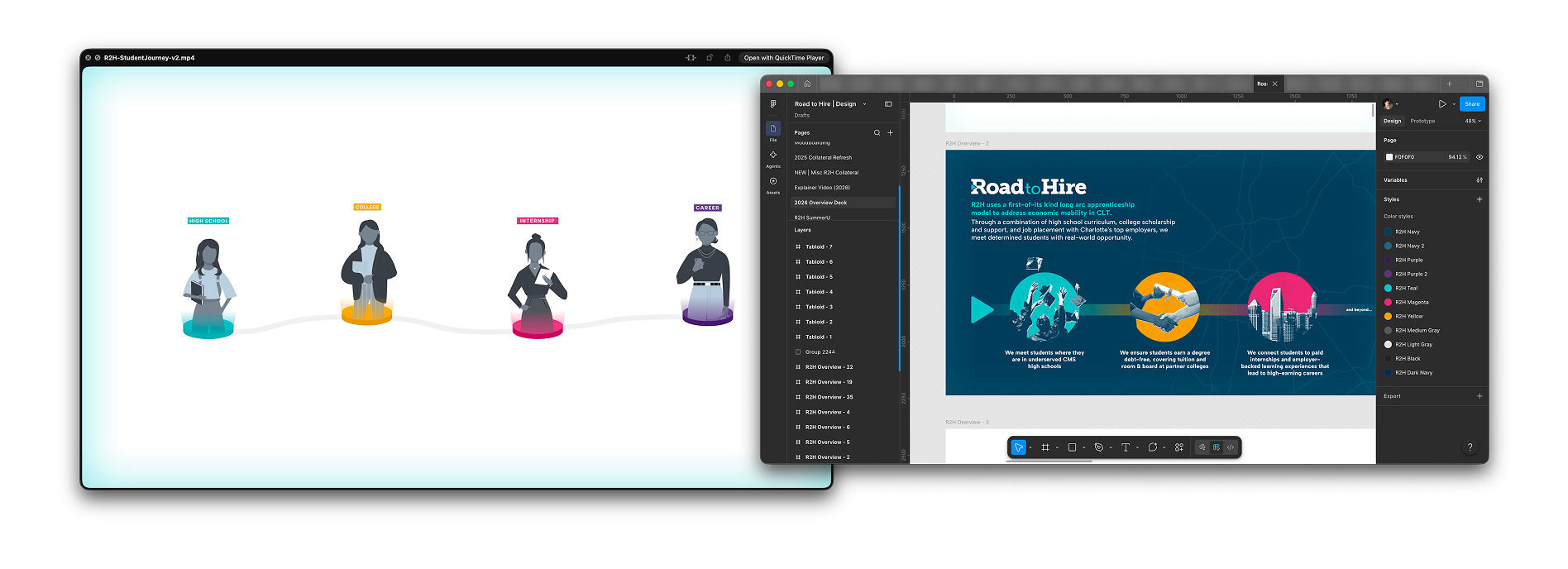
With the new modular brand idea in mind, this revamped color palette also allowed for more opportunity to visually differentiate the different steps along the Road to Hire student journey. A large part of the Road to Hire program's success is that they follow students at each step of their career journey from high school to early career and beyond. Each step requires a different program and different levels of attention to get students to the information and training they need to secure these careers. In my new modular brand system, these steps are now differentiated by color.
Typography
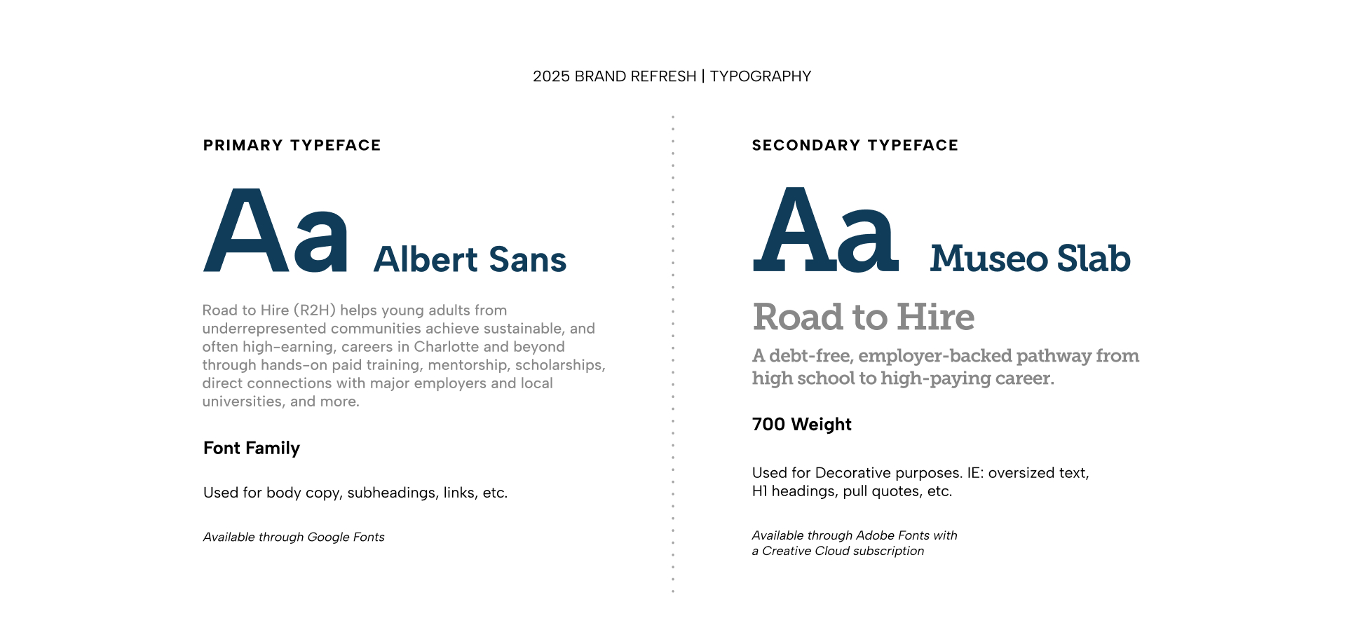
As I mentioned before, Road to Hire had a very barebones branding kit in the beginning: a logo, some colors, and a decision to use Open Sans as their typeface because it was easy to access on different platforms.
For the refresh, I wanted to find typography that felt more intentional. Typefaces shouldn't just be chosen on a whim, especially if they are going to be paired together for all future collateral. All while bearing in mind that it would still have to be accessible on different platforms to suit the team's needs.
I chose Albert Sans and Museo Slab. Museo Slab was already the perfect choice for the logo, and I wanted the typeface of the logo to expand beyond that as a part of the new identity, whereas before they had no relation. Albert Sans has a lot of similar characteristics to Museo. For example, both typefaces share a near-identical lowercase "t" and have nearly circular "O" shapes. Both type families offer many different options for weight. Albert Sans is also available through Google Fonts, and since the R2H team relies on Google Slides, Docs, and Drive, this meant they would have access across their tools.
Also, coincidentally, Albert is the name of the classroom that R2H uses for its students (named after Albert Einstein).
Website
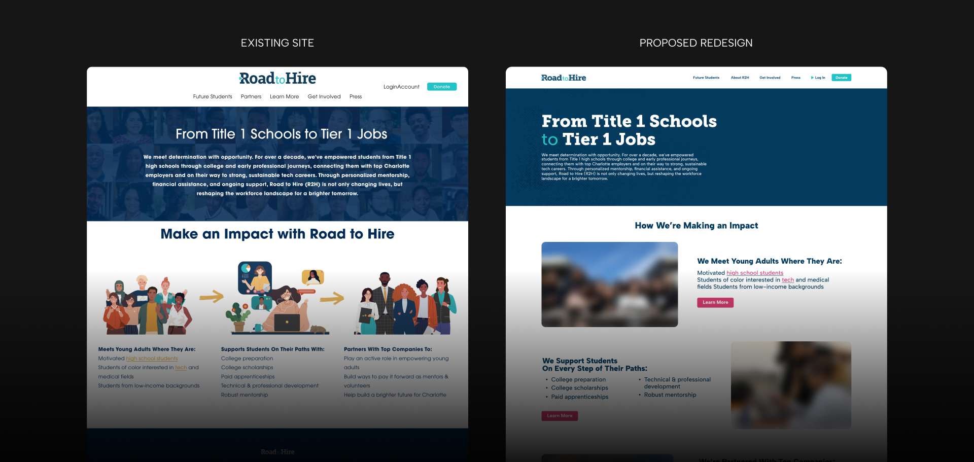
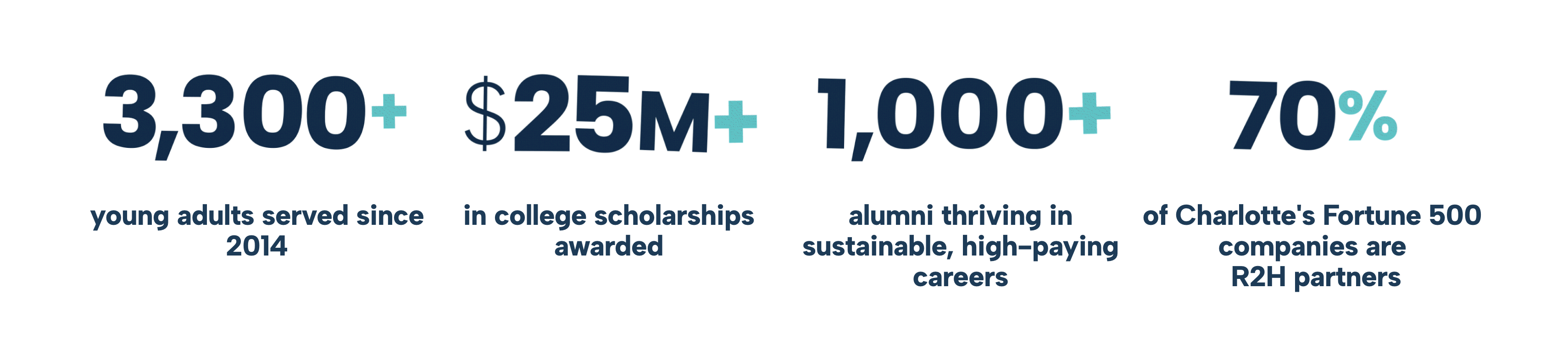
A large part of the refresh was a ground-up redesign of the Road to Hire website. The website is built on Squarespace; the original layout had little imagery, a basic format, and only a few pages dedicated to the programs.
I wanted Road to Hire's new website to reflect its focus on the students' wellbeing. I proposed a layout with images of students engaged in the program or at their new internships.
The website uses the new color palette to create contrast and clarity of information. I also coded custom hover animations to make the site feel less like a Squarespace template and more like a site built with intention.
Custom animated text gives the program more personality and makes it feel a bit more approachable to students.
References to Charlotte are scattered throughout, including the skyline and maps of the roads.
Halftone imagery and textures give the site more versatility; they make the page feel a bit more tactile and hands-on, like the R2H program itself. I used cut-paper aesthetics on the testimonial photos to give the page more of a scrapbook feel.
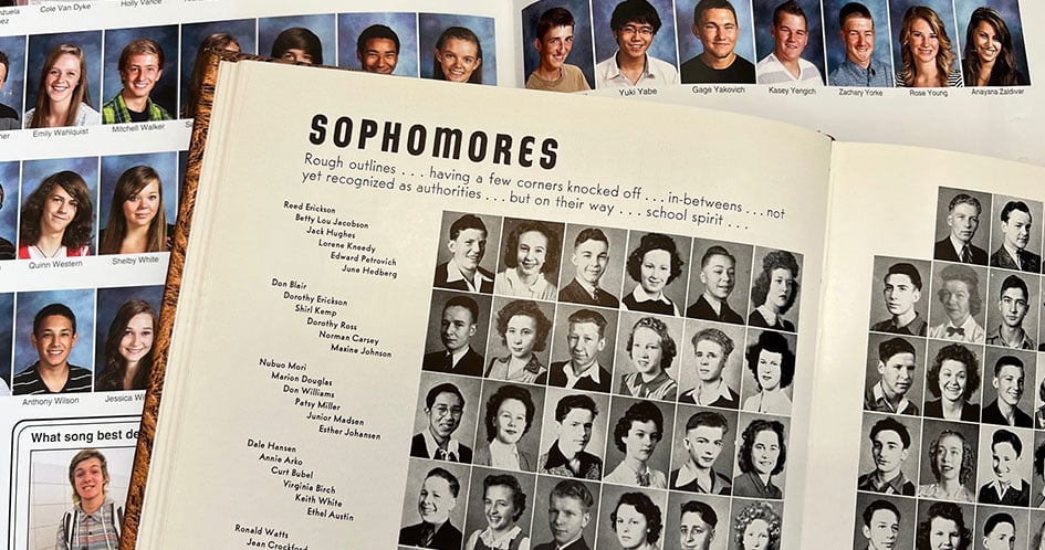
On the leadership page, names are stacked vertically to the left of the photos, which are arranged horizontally. I borrowed this layout from the way high school yearbooks are designed to make the page feel like a school faculty. (Fun fact: my first experience as a designer was on my school yearbook team.)
Closing
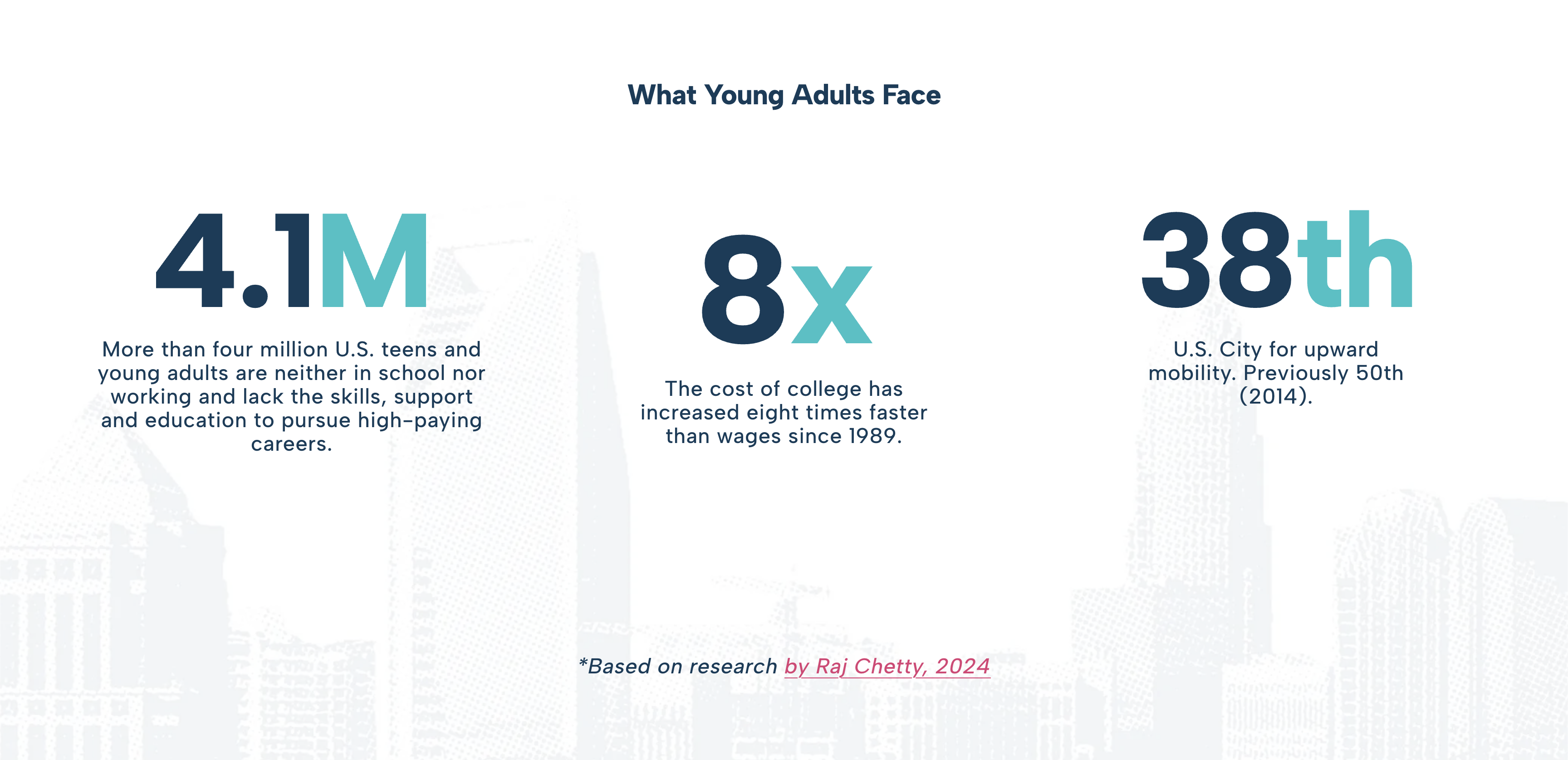
I really enjoyed working on this project. Road to Hire's mission is one that I think is very admirable. Charlotte is one of the country's fastest-growing cities, where gentrification is incredibly rampant. It's a city whose history has affected its infrastructure; for example, historically Black communities were segregated from the city's center by unnecessary highways. Today, the flood of big tech companies coming to second-tier cities (like Charlotte in particular) is making those existing wealth gaps even wider.
I know members of the Road to Hire team personally, and they really care about what they do. For almost all of them, it's much more than a job. They really take time to get to know all of the students, and the fact that the alumni stick around proves that it's an impact that goes both ways. It might be a way to fast-track talent to corporations, but at least it's talent that is breaking generational wealth gaps. Students have been able to purchase homes, buy their first car, and raise families. Things that aren't possible on average in a city like Charlotte.
For more animation work from this project, see my latest animation reel here.

Credits
All work featured was created for Road to Hire.
Work was created in collaboration with the Road to Hire and Red Ventures comm's and media teams.
All of the visuals you see here were designed by me.
None of this work was created using AI.